 Cajista
Guides · Album design
How to design a wedding album, step by step
An album isn't a selection of the best photos: it's the wedding told in twenty spreads. This guide walks through the work in the order it's done —selecting, sequencing, composing, reviewing and delivering— with the judgement calls that separate an album people flick through from one they keep coming back to.
Updated 14 October 2026 · 9 minute read
1. Before you start: size, lab and number of spreads
Three decisions shape everything that follows, and changing them halfway through means redoing layouts:
- Size and shape. A 12 × 12 in square and a 12 × 16 in portrait album don't take the same layouts: in the square one the open spread is very wide (24 × 12) and wants landscape photos or pairs; in the portrait one each page stands on its own. The usual sizes are covered in Album sizes and resolution.
- The lab's specifications. Bleed, safe area and spine are set by whoever prints, not by whoever designs. Ask for them before placing the first photo: a full-bleed image or a caption near the gutter depends on them. It's all in Preparing an album for print.
- The number of spreads. Usually set by the package the couple booked. As a guide, a twenty-spread wedding album (forty pages) tells a full day well without dragging; under fifteen you'll have to leave out moments the couple will miss, and above thirty the pacing suffers unless the selection is very strong.
2. The selection: how many photos, and which
The question isn't how many photos fit, but how many each spread can carry without turning into a contact sheet. A rule that works: three to five photos per spread on average, with single-photo spreads and six- or seven-photo spreads scattered through the album. For twenty spreads that's sixty to a hundred photos.
When choosing, work in layers:
- The must-haves. The ones the couple would never forgive you for leaving out: the vows, the rings, the entrance, the first dance, the parents, the group photo. Mark them first and don't second-guess them.
- The storytellers. The ones that explain what the day was like: the venue, the light, getting ready, the guests' faces. They give the must-haves their context.
- The details. Shoes, bouquet, invitation, hands, table. They give the eye a rest between photos of people and work very well in pairs or threes.
And one cut in the opposite direction: one frame per burst. Two near-identical photos on the same spread don't add up; they take value from each other.
3. The sequence: telling the day
Chronological order is nearly always the starting point, because it's the one the reader follows without thinking. Sorting by capture time —and fixing by hand whatever came from a second camera or a second shooter with a clock that was off— does most of the work.
Within the chronology, think in scenes rather than single photos: getting ready, arrival, ceremony, exit, couple's portraits, cocktail hour, reception, party. Each scene takes one or more whole spreads, and a spread shouldn't mix two scenes except at the transitions. That gives the album chapters you recognise as you turn the page.
There's room for licence: venue details can open the album even if they were shot mid-afternoon, and the best couple's portrait can go up front as an inside cover.
4. Composing each spread
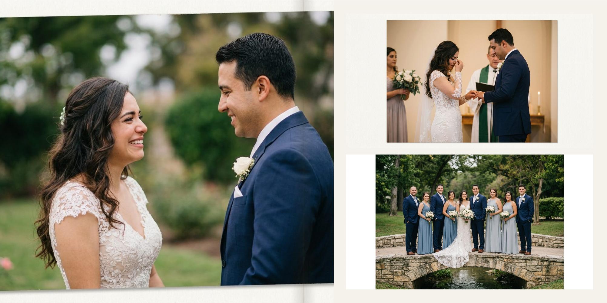
The spread —the two pages you see at once when the album is open— is the unit of design, not the page. A few rules that save a lot of back and forth:
- One photo leads. On each spread, one image should clearly be the hero by size. If they're all the same size, the eye doesn't know where to start.
- Mind the gutter. The centre of the spread is the spine: in layflat bindings it barely shows, but in the others part of the image is lost. Never put a face there. If a photo crosses the spread, let the gutter fall on background, sky or wall.
- Eyes look inwards. A person on the left page looking left “walks out” of the album. Place them so they look towards the centre of the spread, or swap the order of the photos.
- Consistent margins. The gap between photos and the outer margin should repeat across the whole album. That's what makes twenty different spreads look like one book.
- Colour and light per spread. A warm indoor photo next to a bluish outdoor one look worse together than apart. Group by light when you can.
- The crop inside the frame. A photo placed in a frame of a different ratio gets cropped. Check you're not cutting off heads, or hands and feet at a joint, and move the crop inside the frame before changing the layout.
5. Pacing the whole album
Once the spreads are built, flip through the album from start to finish without stopping on any of them. What you're after now isn't each spread being right, but the sequence breathing:
- Alternate density. After two or three busy spreads, a single full-page photo rests the eye and gives that moment weight.
- Don't repeat a layout back to back. The same arrangement on two consecutive spreads shows straight away, even with different photos.
- Open and close strong. The first and last spreads are the most looked at. Save two of the best photos of the day for them.
6. The couple's review
This is where an album stretches into weeks. Three habits shorten the rounds:
- Send a document, not a gallery. A PDF of the spreads as they'll be printed is understood at a glance; a gallery of loose photos makes people imagine the album.
- Ask for changes in one go, numbered. “Spread 7: swap grandma's photo for one where she's smiling”. Agree up front how many rounds the price includes.
- Don't send the print file. What the couple sees should be a light proof, at screen resolution and without bleed: bleed on screen looks like a cropping mistake and prompts questions that don't matter.
7. Preparing the files for the lab
With the album approved, all that's left is generating the final files: at full size, at the resolution the lab asks for (nearly always 300 PPI), with the bleed it asks for and in sRGB unless told otherwise. Before sending, check there are no empty frames, no photo with too little resolution for its size and no text hugging the trim. It's covered in detail in Preparing an album for print.
Doing it in Cajista
Cajista follows this same order: it groups the shoot into scenes by capture time, lays out the spreads from your favourites —avoiding the same layout on consecutive spreads and putting each photo in the frame that crops it least— and lets you move, crop and adjust every frame by hand, flagging photos that fall short on resolution. The proof for the couple comes out as a PDF with no watermark, and the print export checks for blank spreads, empty frames and text over the trim before generating the files. Your photos never leave your computer.
Designing is free with no sign-up; you only pay for the file that goes to the lab.